For Cora's portrait, I found a square piece of glass that showed reflection, because one of her drafts was one where she photographed reflections of herself. There wasn't a certain angle that she photographed at, so I took the photo of her standing up.
For Kyle's portrait, I tried to copy the series he did where he photographed his subjects while they created shapes with their bodies. After he photographed his subjects, he added an overlay of some sort, like dots for example.
For Max's portrait, I tried to copy the portrait series where he photographed his subjects very close up, and in black and white. He used selective framing in his series, where he would focus more on the upper part or the lower part of the subjects face. He also photographed using flash and tried to show the raw emotions of his subjects.
For Aussie's portrait, I tried to copy her fashion/model series where she photographed her subjects in black and white, trying to capture a model type feeling.
For Joshua's portrait series, I focused on the series where he took blurry portraits. He got up close to the subjects face, shot it in black and white, and shook the camera around. After taking the picture, he put a filter on the camera where he added a grey frame to the edges of the photo.
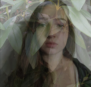
For Greer's portrait, I focused on her series where she did portraits with an overlay of plants. She would start by taking a portrait either flat on or a side view, just a simple raw portrait. Then, she would photograph a plant, maybe a pretty flower or some bushes, and then would place the plant on top of the portrait, creating this beautiful overlay.


This set is awesome because of the textures in the photos and the styles are telling of the people who took photos like these before. Nice work!
ReplyDeleteI like the editing that you did to each of the photos. Great job!
ReplyDeleteI think you did a great job taking portraits of half of the class in their style. I really like how you created Greer’s portrait with the overlay of the plants like she did in her most recent series. I also really like how you included the back framing to the blurry portrait of me. Overall, great job on all of your photos!
ReplyDeleteyou did an awesome job with these, it really looks like these people could have created there portraits themselves!!(mine looks just like something i would have done) great job:P
ReplyDeleteI think you did a really good job with these photos! I especially like the first photo of Cora and I think it's a really good representation of her style! Good Job!
ReplyDelete